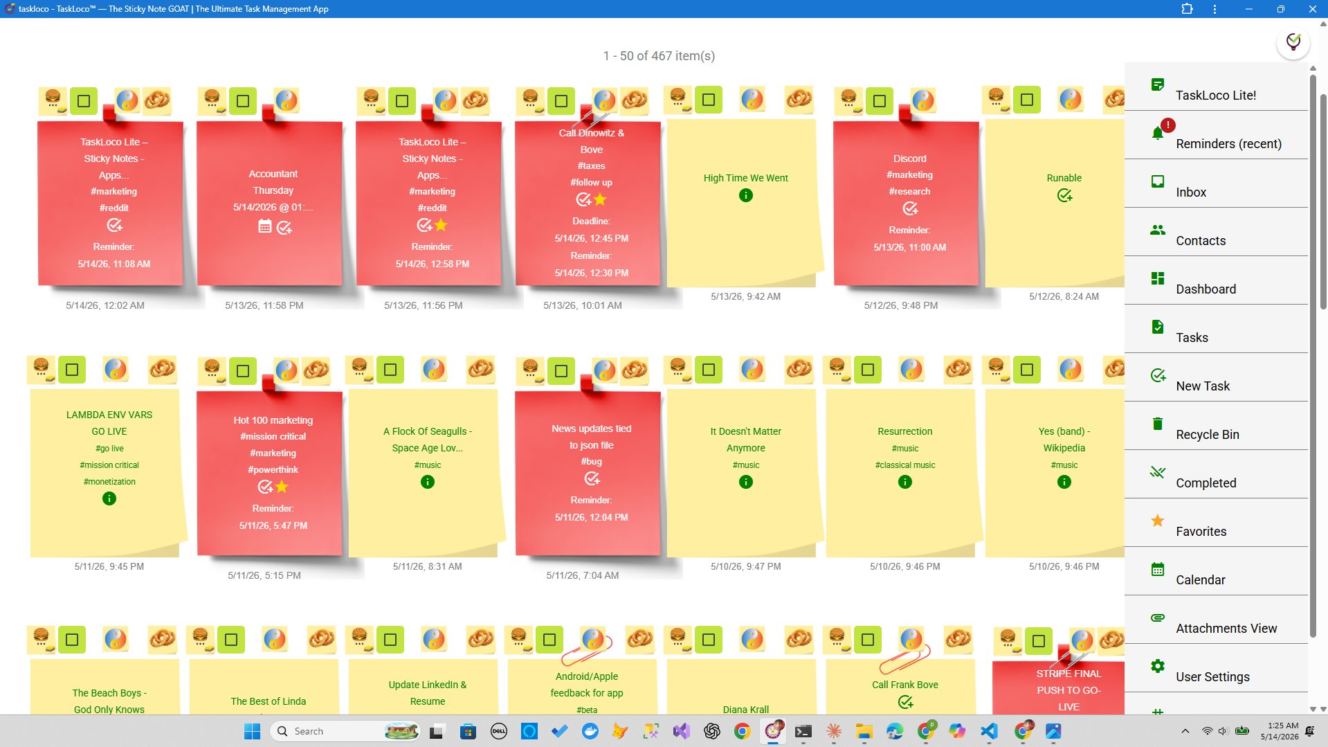
Walk into any serious film production, war room, or startup sprint and you'll find the same thing stuck to the wall: sticky notes. Not a project management dashboard. Not a sidebar with nested subtasks. A wall covered in colored squares that anyone can read from across the room. There's a reason this keeps happening, and it has nothing to do with nostalgia for analog tools.
The sidebar became standard because screens are flat and space is scarce. But cramming tasks into a vertical list in the corner of your screen isn't a design choice — it's a compromise. The wall was never the primitive option. It was the right option all along, and the research on how humans process spatial information explains exactly why.
Your Brain Navigates Space, Not Lists
Cognitive scientists call it spatial cognition — the brain's ability to assign meaning to physical location. You already do this constantly without thinking. You know your coffee is to the left of your keyboard. You know the urgent thing is pinned near the door. You remember where something was, not just what it was called.
Sticky notes on a wall exploit this directly. A note pinned to the upper-left corner registers differently than one in the lower-right, even before you read it. Your brain stores the position as context. That context is loaded instantly, passively, every time you glance at the wall — no clicks required.
A sidebar works in direct opposition to this. It's a linear list. Everything occupies the same spatial address — a narrow strip on the left or right edge of your screen. The only way to find something is to scan sequentially or search by text. You're forced to convert spatial memory into text recall, which is slower and more effortful for most people.
This is why even experienced project managers who live inside digital tools still reach for a whiteboard when they need to think through something complicated. The wall isn't a workaround. It's the brain's preferred format.
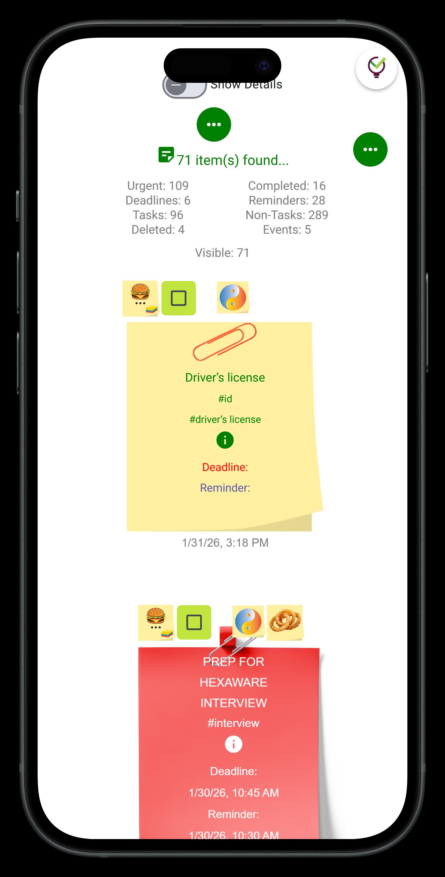
The Sidebar's Hidden Tax: Context Switching Inside a Single Screen
Sidebars were designed for navigation, not thinking. They show you where to go, not what's happening. But most task management tools have repurposed them as the primary task view — which means every time you want to understand your workload, you're using a navigation panel as a canvas.
Here's the practical problem: a sidebar is almost always hidden or collapsed when you're doing real work. You open a document, a spreadsheet, a browser tab. The sidebar disappears. The mental model you were building — what's in progress, what's next, what's blocked — evaporates with it. You have to rebuild it from scratch the next time you glance back.
A physical wall doesn't have this problem. It's persistent. It's ambient. You can look up from your work, take in the whole board in two seconds, and look back down. That ambient awareness is one of the most underrated features of the physical sticky note system, and it's almost entirely absent from sidebar-based tools.
There's also a subtler issue: sidebars reward adding tasks, not completing them. Because everything is the same size, the same color, and in the same column, there's no visual reward for progress. A wall lets you move notes. Physically sliding a card from 'In Progress' to 'Done' triggers a different kind of satisfaction than checking a checkbox. The movement reinforces completion. The checkbox reinforces administration.
How to Build a Wall System That Actually Works
Whether you're doing this physically or digitally, the principles are the same. The wall only works if you give positions deliberate meaning. Here's a method that works across contexts:
- Establish columns by status, not category. Backlog → In Progress → Review → Done is a better horizontal layout than Work / Personal / Admin. Status tells you where a task is in its lifecycle. Category tells you what it belongs to. Status is more useful at a glance.
- Use color for source, not urgency. It's tempting to make every urgent note red, but urgency changes daily and you'll end up with a wall of red. Instead, assign colors to areas of your life or work — one color per project or domain. Urgency can be communicated with position (top row = high priority).
- Leave empty space intentionally. A crowded wall is a broken wall. If every column is full, the system has stopped filtering. Limit each column to a number you set in advance. If 'In Progress' is capped at five notes and you try to add a sixth, something has to move or be dropped first. Constraints create honesty.
- Do a wall review, not a list review. At the end of each day or week, stand back and look at the whole board before touching anything. What's stuck? What's been in 'In Progress' for three days? The spatial view reveals stagnation that a list buries under new entries.
- Archive, don't delete. Completed notes should go somewhere visible but separate — a 'Done' section on the far right, or a separate board entirely. The visual history of completed work is motivating and informative. Deleting it is like erasing your own scoreboard.
None of this requires a specific tool. You can do it on a physical wall with actual sticky notes, on a whiteboard with tape lanes, or on any canvas-style digital workspace. The method is the point, not the medium.
TaskLoco Takes the Wall Digital Without Turning It Into a Sidebar
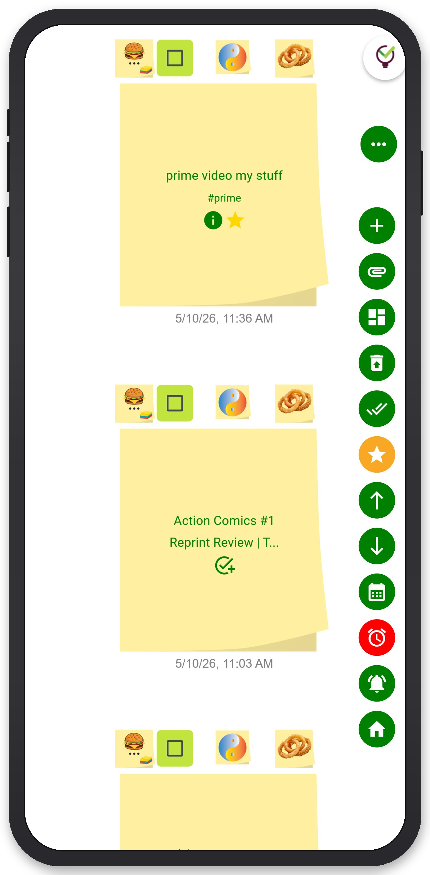
If you want to take this system into a digital workspace that doesn't immediately collapse it back into a list, TaskLoco is worth a look. It was built around the wall metaphor — notes exist on a spatial canvas, not in a sidebar — so the principles above translate directly rather than fighting against the interface.
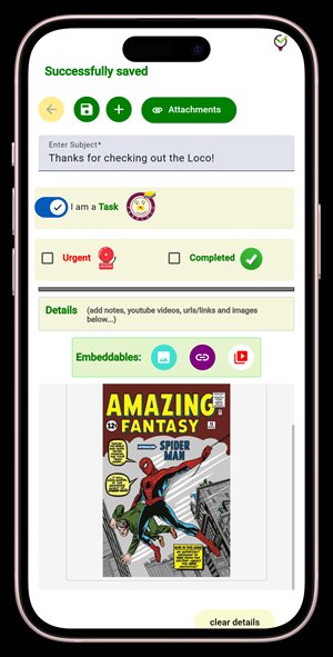
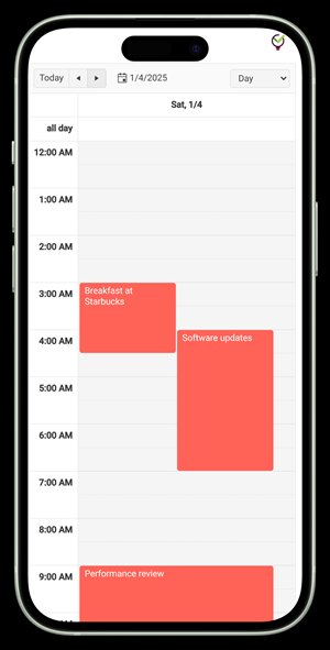
With TaskLoco Premium, notes can carry file attachments, so a note pinned to 'In Progress' can hold the actual document, image, or reference file it relates to — not just a pointer to it elsewhere. Push notification reminders deep-link back to the original note, so when you're nudged about something, you land directly in context rather than at a generic task list. Email and SMS notifications are available as optional add-ons if you want those channels too. The calendar view maps notes with due dates onto a timeline without removing them from the wall, so you get both the spatial and temporal view simultaneously.
Team sharing works the way email does — you share a note, the recipient can clone it and make it their own, no permission levels to configure. It's frictionless enough that it doesn't break the wall metaphor the way a formal assignment workflow would.
There's also a free path in: TaskLoco Lite is a native iPhone and Android app, completely anonymous with no sign-in required, that stores up to 20 notes locally on your device. Neither free tier includes reminders or file attachments — those are Premium — but they're a real way to try the wall approach before committing to anything.
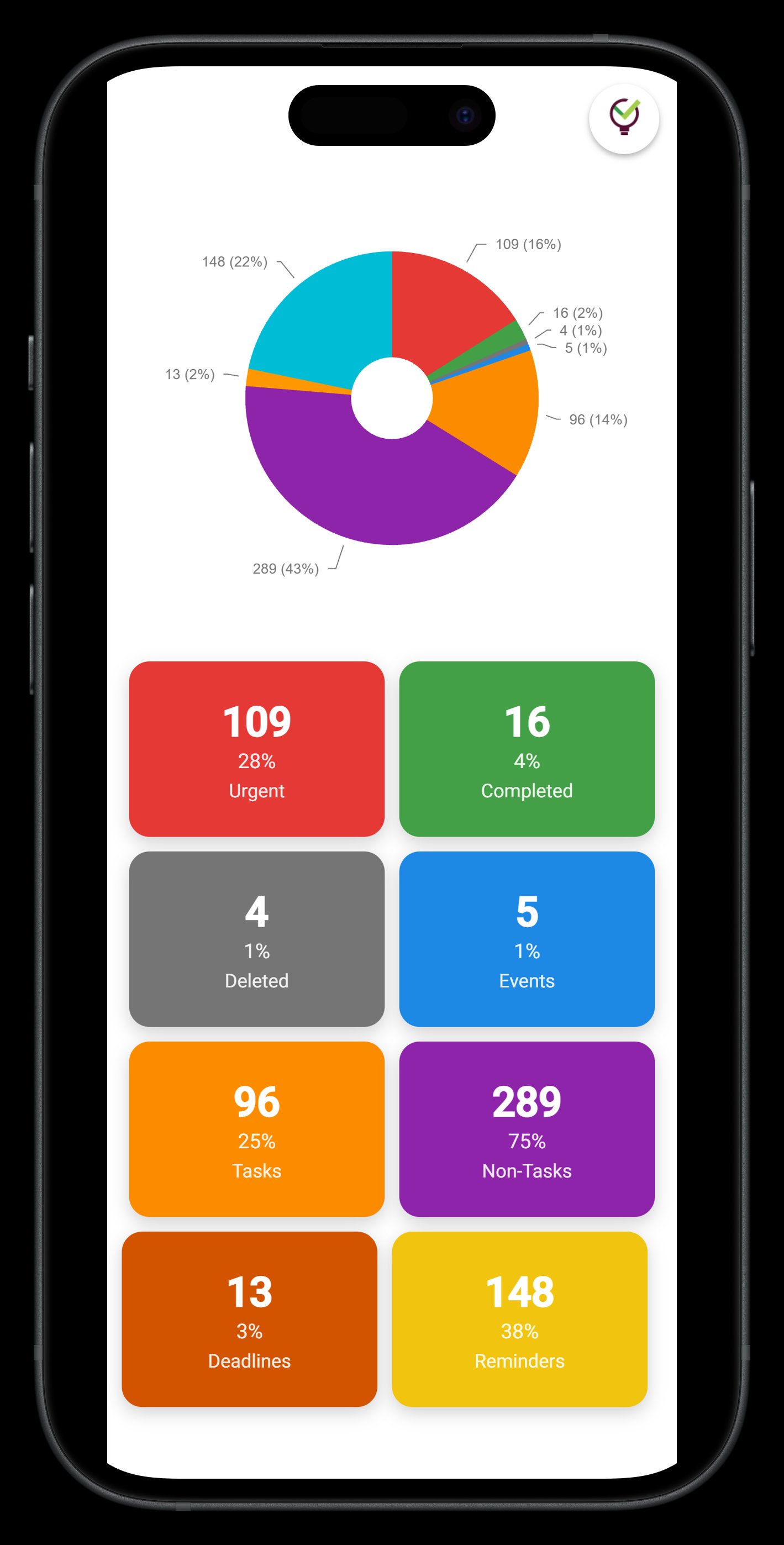
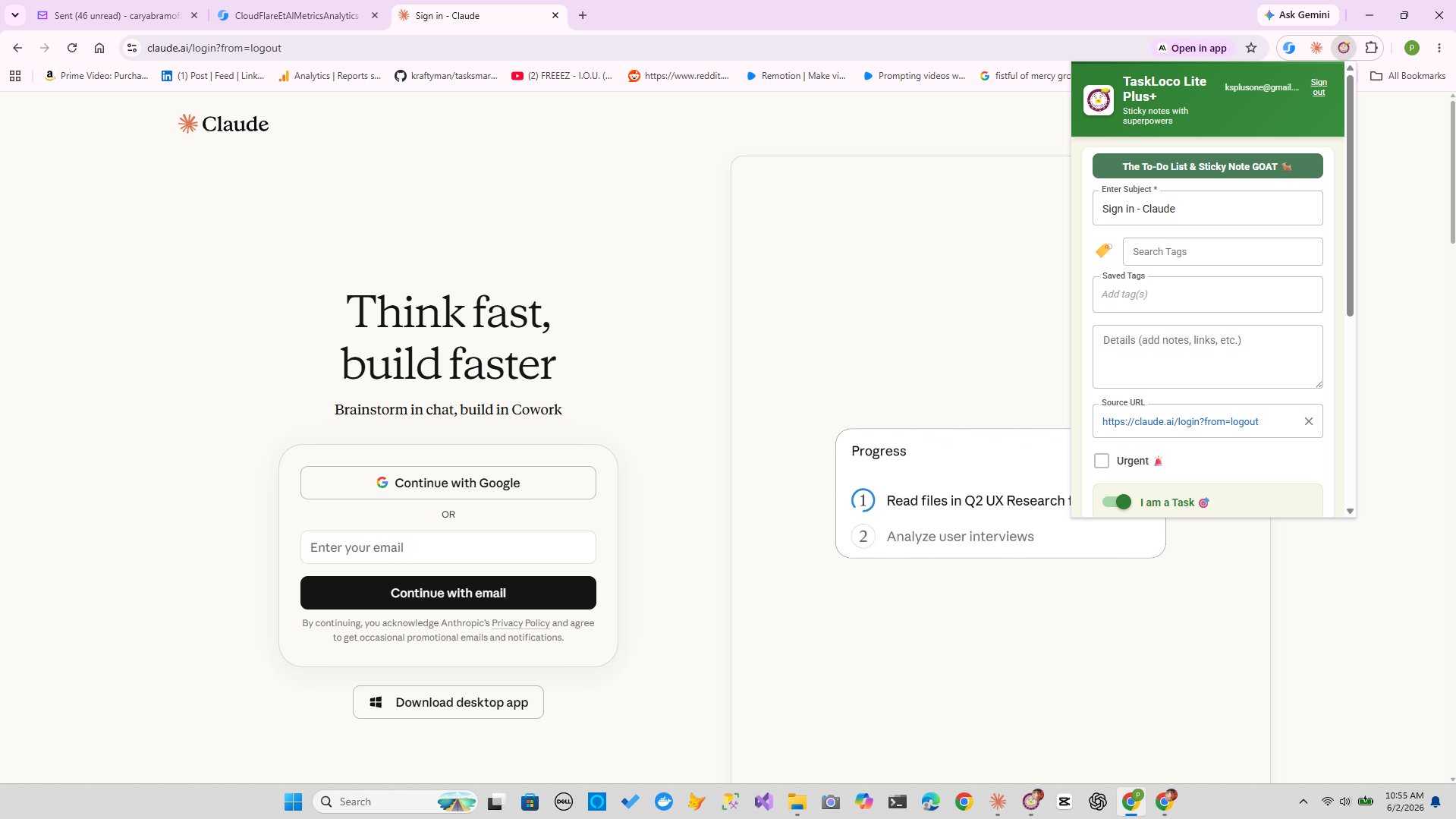
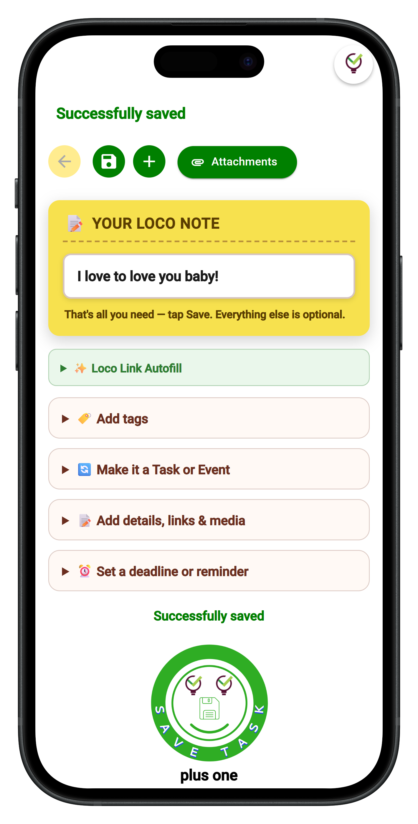
TaskLoco Premium is regularly $9.99/month per person. Right now, charter members can lock in 50% off the regular price — forever. That means $4.99/month per person today. And if our price ever goes up, you still pay half. Always.
Code CHARTER50 auto-applies at checkout. First 500 spots only — once they're gone, this offer is gone permanently. Act fast while spots last.
Every Premium subscription includes unlimited notes, 10GB file storage, reminders, calendar, and team sharing. Each team member requires a separate subscription. 7-day free trial — no charge until day 8. Cancel anytime.
Free Options: TaskLoco
TaskLoco Lite
- Native iPhone & Android app
- Completely anonymous — no sign-in
- Data stays on your device
- Up to 20 notes
- Free forever
TaskLoco Lite Plus+
- Web app + Chrome extension
- Sign in with Google
- Wall syncs across all devices
- Up to 30 notes
- Free forever
Lock In 50% Off — Forever
7-day free trial. No charge until day 8. CHARTER50 auto-applies at checkout.
🔒 Lock In My Charter SpotSee TaskLoco in Action
Frequently Asked Questions
Why do physical sticky notes on a wall feel more organized than digital task lists?
Because your brain uses spatial position as information. When a note is in the upper-left corner, that location carries meaning — you don't have to read it to know roughly what it is or where it stands. A digital list puts everything in the same spatial address, so every review requires you to read sequentially rather than glance spatially. The wall leverages a cognitive system that's already running in the background. The list fights it.
What's the difference between a Kanban board and a sticky note wall?
A Kanban board is a formalized version of the sticky note wall — it applies specific column rules (Backlog, In Progress, Done) and often enforces work-in-progress limits. A sticky note wall is the freeform version where you define the structure yourself. Kanban adds process discipline; a wall adds flexibility. Which one you need depends on whether your work is repetitive and process-driven or exploratory and variable. Most people benefit from a hybrid: wall-style spatial layout with a few deliberately placed column boundaries.
How many sticky notes is too many on a wall?
When you stop being able to take in the whole board at a glance, you have too many. A useful rule of thumb: if reading the entire wall takes more than 90 seconds, it needs pruning. For column-based systems, capping each active column at five to seven notes forces you to complete or drop things before adding more. The constraint is the feature — a wall without limits becomes a backlog with sticky notes on it, which is exactly what you were trying to escape.
Can digital sticky note apps really replicate the feeling of a physical wall?
The best ones come close by preserving the spatial canvas — letting you place, move, and group notes freely rather than forcing them into a fixed list. What they can't fully replicate is the tactile feedback of moving a card and the peripheral awareness of a board you can see while doing other things. What they add is search, attachments, reminders, and access from any device. For most people, the trade-off is worth it as long as the tool doesn't collapse the spatial layout into a sidebar or list the moment you open it.
What colors should I use for sticky notes in a wall system?
Assign colors to domains, not urgency. Pick one color per project, client, or area of your life and stick to it. Use position on the wall — top row, left column — to communicate urgency or priority. If you use color for urgency, everything becomes red within a week and the system stops working. Color by domain means every note's origin is visible at a glance, which is useful when you're scanning for what to work on next across multiple projects simultaneously.
How does TaskLoco handle the wall layout digitally?
TaskLoco is built around a spatial canvas rather than a sidebar or list. Notes exist on a wall where position carries meaning — you can arrange them by status, project, or any structure you choose. Premium adds reminders that deliver push notifications deep-linking back to the original note, file attachments up to 10GB, a calendar view, and team sharing. The free tiers — Lite (native app, 20 notes, no sign-in) and Lite Plus+ (web app, 30 notes, synced across devices) — let you test the approach without a subscription. $9.99/month per person (currently $4.99/month per person for first 500 charter members with code CHARTER50)
Is the sticky note wall method useful for teams, or just individuals?
It works for both, but the rules change slightly for teams. Individual walls can be personal and idiosyncratic — your color system doesn't need to make sense to anyone else. A shared team wall needs a shared vocabulary: agreed column definitions, a consistent color scheme, and a norm around when to move cards. Without that, the spatial clarity that makes a wall powerful becomes spatial chaos where no one trusts the positions they see. Shared walls benefit from a brief setup conversation before anyone pins a note.
Born in Brooklyn. Powered by AWS. Your data stays yours.
TaskLoco is available on iPhone, Android, Chrome, and every web browser.