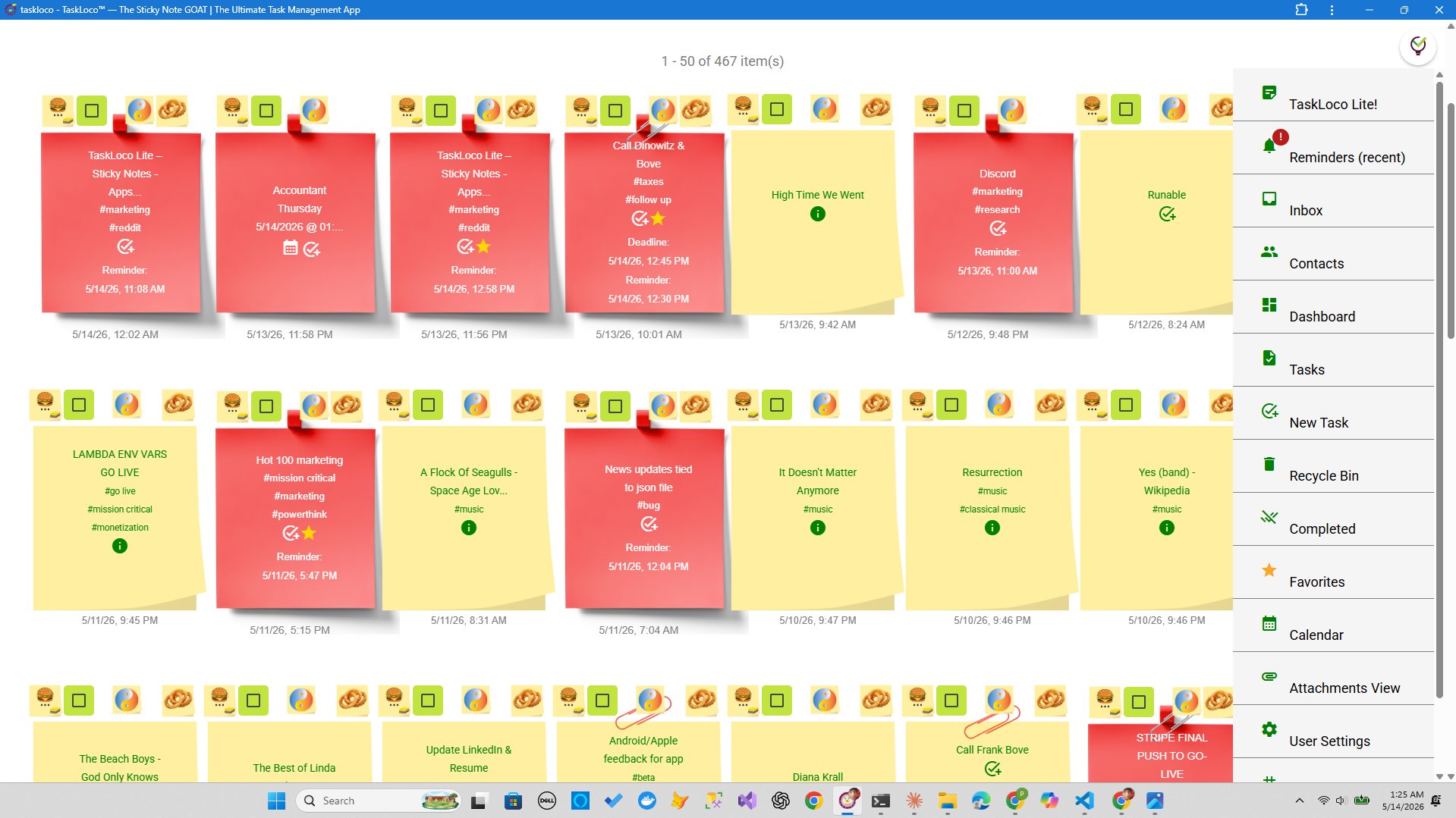
Most productivity software wasn't designed for the person doing the work. It was designed to close a sales deal with an IT department. That's why it has seventeen nested menu levels, a settings page that requires a PhD to navigate, and a dashboard so cluttered that the first thing every new hire does is ask a colleague how to find the actual task list. The UI isn't a side effect of corporate software — it is the product, built to look expensive and justify a budget line.
Sticky notes, by contrast, started as a physical object with zero learning curve. You write something. You stick it somewhere visible. You move it when things change. That interaction model is so intuitive it survived fifty years without a manual. When software builds a UI around that same model — a visual wall of notes you can see all at once, rearrange, color-code, and act on immediately — it isn't dumbing anything down. It's respecting the user's time and attention. This article is about why that distinction matters, how to think about it concretely, and what you're actually giving up when you accept bloated corporate UI as the default.
What 'Corporate Slop UI' Actually Means and Why It Spreads
Corporate slop UI isn't just ugly software. It's a specific failure mode with a specific cause: the person choosing the tool is never the person using it. When a VP or IT director selects productivity software, they're responding to a vendor demo that emphasizes feature count, security certifications, and integration logos. The resulting UI reflects those priorities — every feature visible at once, every permission level surfaced, every possible workflow accommodated through an ever-expanding sidebar.
The people who then have to use that UI daily didn't have a vote. And because switching costs are high and 'we already paid for it' is a powerful argument, the bloated tool becomes entrenched. Deviating from it feels risky — even when everyone privately admits it's slowing them down.
The psychological mechanism here is important: complexity signals legitimacy in a corporate context. A tool with forty icons in the nav bar looks serious. A tool that shows you a colorful grid of notes looks casual. That perception gap has nothing to do with what each tool actually accomplishes. It's pure social signaling, and it costs organizations enormous amounts of time every day.
The spread of corporate slop UI is also self-reinforcing. New employees learn whatever tool the company uses. They build habits around it. When they move to a new job, they recommend the same tools because familiarity feels like competence. The cycle continues independent of whether the tool is actually good.
Why Sticky Note UI Works With Your Brain Instead of Against It
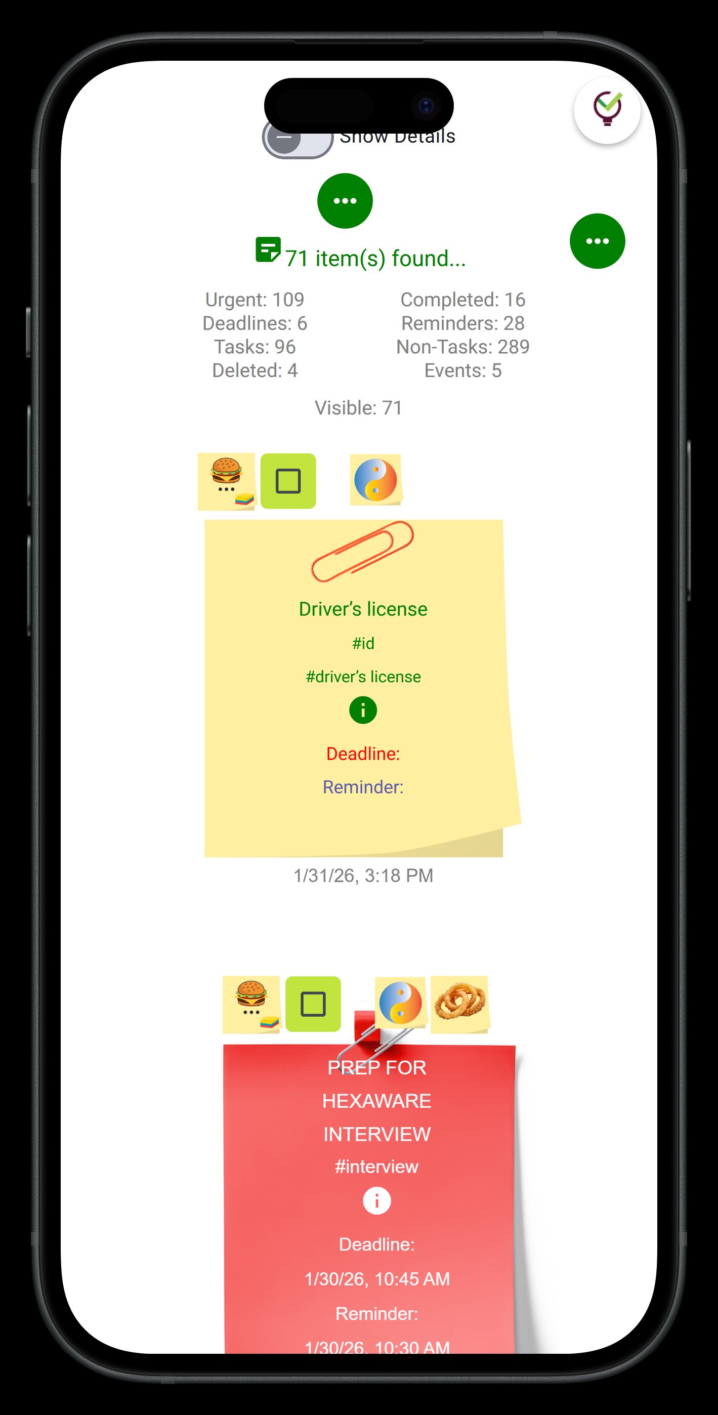
Cognitive scientists have a phrase for it: spatial memory encoding. When information is arranged in physical or visual space, the brain uses location as a retrieval cue. You don't just remember the task — you remember where it was on the board. That's why a wall of sticky notes is easier to navigate than a list buried in a sidebar: position carries information that a flat list throws away.
This is also why whiteboards survive in every office even when the company has spent a fortune on digital tools. People walk up to a whiteboard, draw boxes, write words, draw arrows, and think out loud spatially. The sticky note UI is a direct digital analog of that behavior. It preserves the spatial relationship between items, lets you cluster related things visually, and gives your peripheral vision something to process while you're focused on one specific note.
- Immediate visibility: Everything important is in view without a click. Your brain can pre-process the wall passively while you're actively reading one note.
- Low-friction capture: Writing a new note takes one action. In a corporate tool, creating a task often requires choosing a project, an assignee, a priority level, a due date, and a tag before you've typed a word.
- Effortless reorganization: Moving a sticky note — physically or digitally — is a gesture. Moving a task in a Gantt chart means drag-and-drop with snapping, dependency warnings, and a save confirmation.
- Color as meaning: Humans process color faster than text. A sticky note wall where red means urgent and green means done communicates status at a glance, without a legend or a filter panel.
None of these advantages require you to sacrifice anything meaningful. Reminders, file attachments, shared notes, calendar views — these are all addable to a sticky note foundation. The visual metaphor doesn't cap your functionality. It just refuses to make you pay a cognitive tax to access it.
How to Actually Shift Your Team Away from Bloated Tools (Without Getting Fired)
The real barrier to switching isn't technical. It's political. If you tell your manager you want to move the team off the current tool because the UI is bad, you sound like you're complaining about aesthetics. The argument that lands is about time and outcomes.
Start by tracking friction. For one week, count every time someone on your team asks a question like 'where do I find X?' or 'how do I do Y in the tool?' Every one of those moments is a failure of the UI that has a real time cost. Compile those instances. Now you have a legitimate operational problem, not an aesthetic preference.
Second, run a parallel experiment. Don't ask permission to replace the tool — ask permission to run a side-by-side for two weeks on a specific project. Pick something low-stakes and time-bounded. Use a sticky note-based system for that project. Track how long it takes to update tasks, how often people check the board versus having to be reminded, and whether the project status is legible to anyone who glances at the board cold.
Third, frame simplicity as a feature, not a limitation. Complexity creep in software happens because each feature sounds good in isolation. 'Wouldn't it be useful to have a priority field?' Yes. 'And a complexity estimate?' Sure. 'And a linked epic?' Okay. 'And a capacity planning view?' Now you've built something no one wants to open on a Monday morning. Simplicity is a deliberate architectural choice, not an absence of ambition. That's the argument to make to stakeholders who equate feature count with value.
Finally, acknowledge the real tradeoffs honestly. Sticky note UIs are not the right fit for every use case. If you're managing a 200-person engineering org with hard dependencies between workstreams, you probably need Gantt charts and timeline views. If you require enterprise SSO and compliance certifications, a note-based tool may not satisfy your security team. Being honest about those limits actually strengthens your argument for everything else: you're not being naive about the tradeoffs, you're making a clear-eyed choice for your actual situation.
TaskLoco: A Sticky Notes UI Built for How People Actually Work
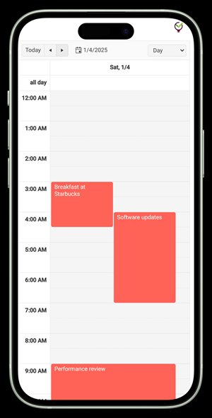
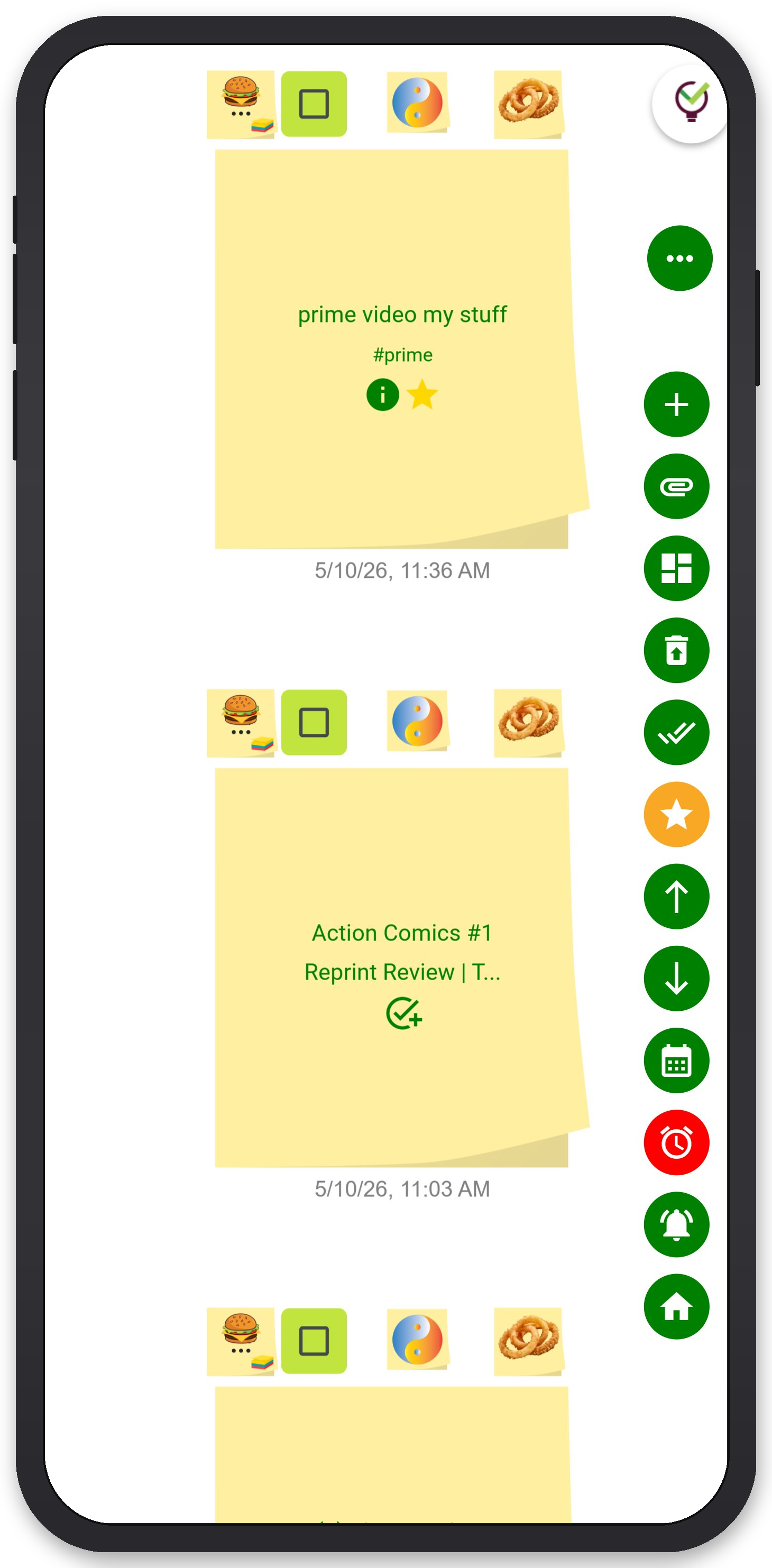
If you're sold on the sticky note model and want a tool built around it rather than bolted on top of something else, TaskLoco is worth a look. The entire product is organized around a visual note wall — your tasks, reminders, files, and calendar events are all anchored to notes, not buried in separate modules with separate navigation.
The wall view puts everything in front of you at once. Notes can carry file attachments up to 10GB of storage. Reminders fire as push notifications directly to your phone or computer — and the notification deep-links straight back to the original note, so you land exactly where the action is. An optional email channel and SMS add-on are available if you want multiple delivery paths. A calendar view surfaces time-sensitive notes without forcing you to leave the note metaphor entirely.
Team sharing works the way email does: you share a note, the recipient can clone it and make it their own. No permission levels, no access tiers, no admin panel to configure before you can collaborate. Full-text search runs across all your notes and attachments, so nothing gets lost even as your wall grows.
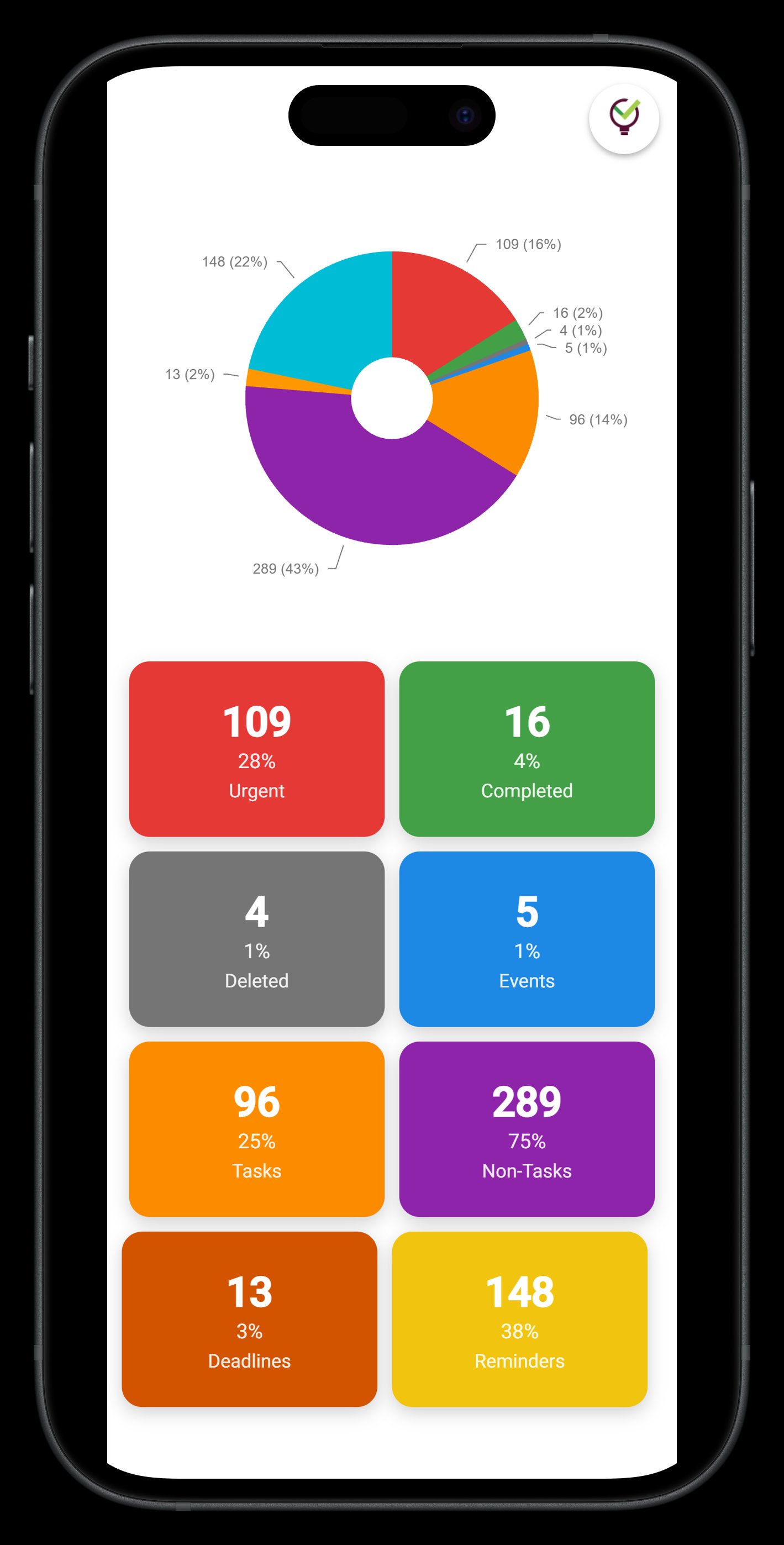
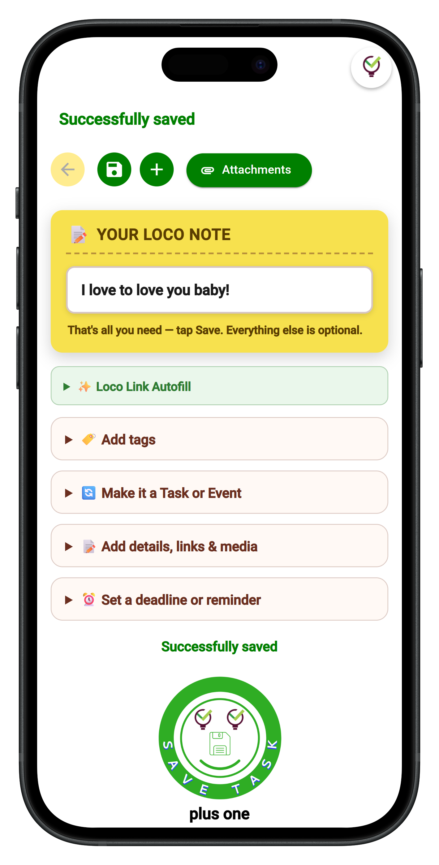
There are two free tiers worth knowing about. TaskLoco Lite is a native iPhone and Android app — completely anonymous, no sign-in required, stores up to 20 notes as a JSON file on your device. It's a genuine no-strings-attached way to try the note metaphor with zero commitment. TaskLoco Lite Plus+ is the web app and Chrome extension, free with a Google sign-in, syncs across all your devices, stores up to 30 notes, and includes a one-click Chrome extension that captures any webpage as a note instantly. Neither free tier includes reminders, file attachments, or team sharing — those live in Premium — but both give you a real feel for the interface before you spend anything.
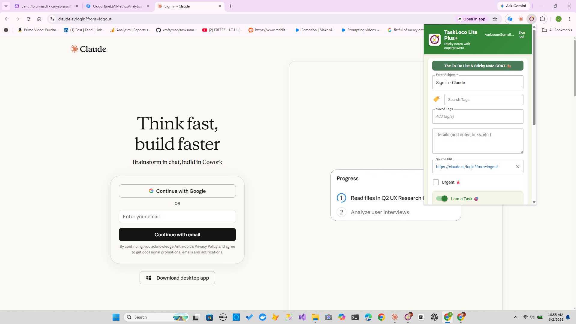
The Chrome extension deserves a specific mention here because it directly addresses one of the biggest friction points in corporate tools: capturing information mid-workflow. When you're reading an article, a spec doc, or a thread and want to save it as a task, you normally have to context-switch to your task tool, create a new item, paste a link, and return. The Chrome extension collapses that to one click. The note is on your wall before you've lost your place.
TaskLoco Premium is regularly $9.99/month per person. Right now, charter members can lock in 50% off the regular price — forever. That means $4.99/month per person today. And if our price ever goes up, you still pay half. Always.
Code CHARTER50 auto-applies at checkout. First 500 spots only — once they're gone, this offer is gone permanently. Act fast while spots last.
Every Premium subscription includes unlimited notes, 10GB file storage, reminders, calendar, and team sharing. Each team member requires a separate subscription. 7-day free trial — no charge until day 8. Cancel anytime.
Free Options: TaskLoco
TaskLoco Lite
- Native iPhone & Android app
- Completely anonymous — no sign-in
- Data stays on your device
- Up to 20 notes
- Free forever
TaskLoco Lite Plus+
- Web app + Chrome extension
- Sign in with Google
- Wall syncs across all devices
- Up to 30 notes
- Free forever
Lock In 50% Off — Forever
7-day free trial. No charge until day 8. CHARTER50 auto-applies at checkout.
🔒 Lock In My Charter SpotSee TaskLoco in Action
Frequently Asked Questions
Is a sticky notes UI actually professional enough for real work?
Yes — and the question itself reveals the problem. 'Professional' has been conflated with 'complex' by years of enterprise software marketing. A sticky note UI is not a toy. It's a spatial, visual interface that matches how humans naturally organize priorities. What it lacks in feature density it more than makes up for in speed of use and clarity. Surgeons use checklists. Architects use sketches. Professionals use the simplest tool that reliably gets the job done.
What are the actual cognitive advantages of a visual note wall over a list or table?
Spatial memory encoding is the core one — your brain stores location as a retrieval cue, so you remember where a note is on the wall, not just that it exists. Visual scanning is also faster than reading down a list: color, position, and size all carry information your peripheral vision processes passively. You don't have to be 'looking' at a note for your brain to register that it's there. List and table views strip all of that out and replace spatial reasoning with linear reading.
Why do companies keep using bloated tools even when employees hate them?
Because the buyer and the user are rarely the same person. IT departments and procurement teams evaluate tools on security certifications, integration counts, and vendor reputation. Those criteria have nothing to do with daily usability. Once a tool is purchased and deployed, switching costs — in money, in retraining, in migration — are high enough that 'everyone hates using it' rarely triggers a change. The UI that wins the procurement process is not the UI that wins the daily experience.
How do you convince a manager to switch away from an established corporate tool?
Don't frame it as UI preference — frame it as an operational cost. Track the friction events: questions about how to find things, time spent navigating menus, tasks missed because the interface buried them. Compile a real number. Then propose a bounded parallel experiment on a specific low-stakes project. Two weeks, one team, a clear comparison of outcomes. That's a testable business case, not a design opinion.
When is a sticky notes UI NOT the right tool?
A few genuine cases: If you're managing hard project dependencies with timeline constraints, Gantt chart views are genuinely useful and sticky notes don't replicate them. If your organization requires enterprise SSO, audit logs, or compliance certifications (SOC 2, HIPAA, etc.), a note-based tool may not satisfy your security requirements. If you need database-style custom fields, relational records, or formula columns, a dedicated database tool is the right fit. For everything else — tasks, notes, reminders, files, team sharing — the sticky note model handles it with less overhead.
How does TaskLoco's free tier work?
TaskLoco has two free tiers. Lite is a native iPhone and Android app — completely anonymous, no account required, stores up to 20 notes on your device only, no sync. Lite Plus+ is the web app and Chrome extension — sign in with Google, syncs across all your devices, stores up to 30 notes, includes a one-click Chrome extension for capturing web pages. Neither free tier includes reminders, file attachments, or team sharing — those are Premium features. Both are genuinely free with no trial expiry.
What does TaskLoco Premium add over the free tiers?
Premium adds unlimited notes, 10GB file storage with additional tiers available, reminders delivered as push notifications to your phone and computer (with optional email and SMS), a calendar view, and full team sharing. Reminders deep-link back to the original note so you land exactly where the action is. $9.99/month per person (currently $4.99/month per person for first 500 charter members with code CHARTER50)
Born in Brooklyn. Powered by AWS. Your data stays yours.
TaskLoco is available on iPhone, Android, Chrome, and every web browser.